Showing posts with label implied volatility. Show all posts

Friday, October 17, 2014

Big move for vol of vol

Staying with the volatility theme, the latest jump in VIX was clearly dwarfed by what we saw in 2008 or even in 2011. However that's not true for the volatility of VIX - the so-called "vol of vol". The CBOE's VVIX Index, "an indicator of the expected volatility of the 30-day forward price of the VIX" (see description), has been comparable to or higher than what we saw during those high stress periods. The possibility of VIX doubling or even tripling ("tail" risk) does not seem outside of the realm of possibilities these days - even from the current elevated levels. And traders are willing to pay a relatively high premium to be able to take advantage of such moves.


_________________________________________________________________________


SoberLook.com
Sign up for our daily newsletter called the Daily Shot. It's a quick graphical summary of topics covered here and on Twitter (see overview). Emails are distributed via Freelists.org and are NEVER sold or otherwise shared with anyone.


From our sponsor:

Thursday, October 16, 2014

Implied vol dislocation

The recent spike in volatility has created a "dislocation" in US equity options markets. VIX, which is a measure of implied volatility for large cap shares is now higher than RVX - the small-cap equivalent. This is highly unusual, since small caps tend to be more volatile. Part of the issue is the outsized spike in the volatility of large energy shares due to the recent sell-off in crude oil.


_________________________________________________________________________


SoberLook.com
Sign up for our daily newsletter called the Daily Shot. It's a quick graphical summary of topics covered here and on Twitter (see overview). Emails are distributed via Freelists.org and are NEVER sold or otherwise shared with anyone.


From our sponsor:

Tuesday, July 15, 2014

The low volatility paradigm and diminishing return expectations

What happens in an environment - such as the one we are in currently - that is characterized by prolonged periods of low volatility? One of the effects of diminished price swings is the decline in return expectations. As an example, the chart below shows the spread demanded by investors in US high yield bonds vs. the volatility of total returns in that market.


This low volatility regime originates from the policies of major central banks, policies that have been both highly accommodative and relatively transparent - at least in the intermediate term. And any market conditions that are viewed as a form of tightening or rising uncertainty are often met with further accommodation. This is particularly true in the US. For example the markets’ negative reaction to the Fed’s looming taper last year was met with a delay and a reduction in taper’s size (“small taper”). The risk that monetary policy will materially deviate from markets’ expectations without the Fed making an accommodative adjustment has diminished significantly, resulting in lower volatility across the board.

Some have suggested that this Fed-engineered muted volatility regime is precisely the reason for low real interest rates. The reduced uncertainty around monetary policy trajectory results in lower volatility in fixed income markets, dampening return expectations. These lower return expectations mean that investors are willing to live with lower coupon in return for smaller swings in the value of their investments.
Deutsche Bank: - If pre-crisis rules for financial engagement [Fed’s involvement in the markets] raised both the volatility in the economy and the return in the economy, then reducing that volatility should reduce economic return. QED: the real rate of growth may be permanently both more stable and lower. … Returns in fixed income may depend progressively less on price and more on income.
The other effect of operating in a low volatility regime for prolonged periods is increased risk taking – often in the form of higher leverage. We've seen this manifested in higher NYSE margin debt and growing leverage of LBO transactions for example. Janet Yellen however continues to downplay the potential for asset bubbles and other threats to financial markets resulting from low volatility. The view at the Fed is that, at least for now, financial stability can be achieved through regulation - including containing asset bubbles. That assumption of course remains to be proven, given some of the past failures of sophisticated financial regulation (see example).

For now the markets have faith that regulation will indeed maintain financial stability in the face of highly accommodative monetary policy and low volatility. And as the low volatility regime becomes the norm, return expectations decline across the board and investors become lulled under the warm blanket of asset price stability provided by the central banks.

_________________________________________________________________________


SoberLook.com
Sign up for our daily newsletter called the Daily Shot. It's a quick graphical summary of topics covered here and on Twitter (see overview). Emails are distributed via Freelists.org and are NEVER sold or otherwise shared with anyone.


From our sponsor:

Sunday, November 3, 2013

US stock market volatility lowest since 2007

Over the past year the daily volatility of the S&P500 index fell below 75bp - the lowest level since 2007.


This result is mirrored by the implied volatility measures, with the daily average VIX touching new post-recession lows.


One of the contributors to this decline in volatility is the retail investor. Over the past year or so the relentless flows out of domestic equity mutual funds have stopped.

Cumulative since end of 2006; unit = $mm (source: ICI)


SoberLook.com


From our sponsor:

Wednesday, June 12, 2013

Declining volatility in crude oil - is it all about to change?

Since posting this chart of WTI crude oil price (sent by a reader) on Twitter, we've received a number of constructive replies. The technical trading term for this pattern is "symmetric triangle", which would typically result in a breakout to either side. Usually such breakouts are accompanied by rising volatility.


Here are some replies (thanks!):


One thing that is certain about the chart is that crude oil volatility has been declining since the financial crisis. Here are three measures that prove it.

1. Crude oil implied volatility is hovering around at least a decade low.

Source: DB

2. The same applies to historical volatility (as to be expected).


3. The CBOE Crude Oil Volatility Index, which is derived from the implied volatility of oil ETFs, paints a similar picture.

Source: CBOE

Now that we've established this fact, what are some of the fundamental reasons for this decline? One of the more credible explanations is the recent diversification of supply sources from the rise of non-OPEC producers, particularly in North America. These new sources of crude reduce the potential impact of any single supply disruption.


Another explanation for declining volatility is a much more modest and a somewhat more predictable global demand growth. This is to a large extent the result of China ending the global commodities "super-cycle" (see discussion here and here). In fact we saw some evidence for this trend today:
Reuters: - The International Energy Agency (IEA) said modest economic growth was limiting oil demand worldwide, and that some developed economies would see absolute declines in oil consumption in 2013.

In China, the world's No. 2 oil consumer, "weaker economic growth and lower than previously forecast March/April consumption data" support the view that demand is weakening, the IEA said.

Both OPEC and the U.S. Energy Information Administration (EIA) cut their global oil demand growth forecasts on Tuesday.
The fundamentals therefore argue for some permanency to this low volatility regime - especially a lower risk of a major spike in prices. From the technical perspective however, we are about to enter the "tip" of the multi-year symmetric triangle and should expect the pattern to break toward higher volatility.

We should know who is right fairly soon.


SoberLook.com
From our sponsor:

Sunday, November 11, 2012

The decline in Europe risk premium is not sustainable

Investors continue to shift attention from Europe to the US, as the fiscal cliff concerns are now center-stage (see discussion). The equity implied volatility risk premium of the Euro Stoxx 50 (SX5E) to that of the S&P500 (SPX) has come off sharply recently.


This is somewhat surprising because Europe is likely to be impacted by the US fiscal cliff economic shock as much as the US, possibly more. The EU member nations' companies are far more vulnerable to a further global slowdown (even if it originates in the US) than the US corporate sector.
CS: - We think that a fiscal cliff-induced growth shock, while negative for the US economy, could prove even worse for Europe. The current macroeconomic picture is one of cyclical stabilization appearing to be under way in the US, compared with a still fragile euro area, where recent data releases have revealed further weakness for the core [see discussion], making substantial deterioration highly likely in the event that extra stress is added to the mix by an external shock.
Indeed, CS expects this ratio to move back up, as the Europe risk premium returns.


SoberLook.com

Sunday, May 6, 2012

Economic surprise index eerily reminiscent of last year

The Citigroup economic surprise index is now clearly in the negative territory in a trend reminiscent of last year's decline.

Citi Economic Surprise Index

BW/Bloomberg: - The Citigroup Economic Surprise Index for the U.S., a gauge of how much reports differ from economists’ estimates in Bloomberg surveys, turned negative on April 25 and fell May 3 to the lowest level since September. Last year, the gauge sank below zero for the first time in five months on May 2, the day when the S&P 500 began a 19 percent drop.
Given the rising concerns out of Europe today, there is a strong possibility we may be looking at sharply higher market volatility. As discussed back in March, the VIX futures curve steepness earlier in the year seemed to be a good predictor of uncertainties in the post-LTRO environment.


SoberLook.com

Friday, March 23, 2012

Implied volatility distortions for short-dated calls are not real

Someone sent us this Bloomberg chart that shows the SPY (ETF) equity option "skew" (implied volatilities across different strike levels) for options with a 1-month maturity. Strike price is shown as a percentage of the current price of SPY. It looks as though the implied volatility on the up-side has spiked dramatically. One explanation proposed has been that as the equity rally stalled and people have sold some of their equity positions, they also bought back the covered calls they shorted earlier - bumping up implied vols.

1 month SPY SKEW: Today, 3 days ago, 1 week ago

But there is a simpler explanation. The deep out-of-the-money options for a 1 month maturity are quoted at a couple of pennies but there are no trades at these levels. As SPY sold off a bit during the week, the options were still quoted at roughly the same levels and there were still no trades.

Call option quotes (Source: Bloomberg) 

Now if options are "priced" at a constant level while the underlying drops, the implied volatility will increase. When options are quoted in pennies and little or no trading takes place, seeming distortions in implied volatility become common. But it's hardly an indication of anything fundamental going on in the market. With the 3-month maturities for example, where option premiums have real value, this distortion no longer exists.

3 month SPY SKEW: Today and 1 week ago (Bloomberg)

SoberLook.com

Sunday, March 18, 2012

The slope of VIX futures curve hits record

As discussed earlier, the VIX (implied volatility index) futures curve has become extremely steep.

VIX futures curve 
.
In fact the slope of the VIX futures curves has hit a historical record last week. The 7th nearby futures contract (UX7) is now almost 13 vol points higher than spot (VIX). The reason for using the 7th contract is that it takes us just over 6 months out - the 6th nearby contract yields the same result. The chart below shows the difference between the two since 2005. The record low of just below -40 was reached during the 08 crisis when the nearby implied volatility was bid up so much, the curve was at a record inversion (negatively sloping).

UX7 - VIX

Where as in 2008 and in 2011 the highly inverted curve indicated an immediate threat to the markets, the current steepness is implying risks further out in time. The market is not buying the sustainability of the current equity rally and is pricing in risks of a material correction later on. This is consistent with other indicators such as the cyclicals underperformance. The record steepness points to the fact that central banks have been successful in suppressing current volatility, but the market is fully expecting it to show up again a few months down the road.


SoberLook.com

Thursday, March 8, 2012

Implied volatility curve is inconsistent with credit spreads

This is the VIX (S&P500 implied volatility) futures curve a year ago showing the implied volatility term structure as it was on 3/8/11.


This is the VIX futures curve now:


See the difference? While the front contract for implied volatility futures is roughly where it was a year ago, the curve is far steeper now. The contracts 6-8 months out have VIX at close to 30%. The markets are pricing in a material spike in volatility by the mid of 2012. The market is basically saying "the world is OK for now, but just wait until late summer". That makes some sense given all the uncertainty, but it is not at all consistent with movements in credit spreads.

The scatter plot below compares the levels of VIX futures six months out (the far end of the curve) with the 5-year Investment Grade (IG) CDX (index of investment grade corporate CDS) spread. The current pricing is a clear outlier. If the credit markets are right, the implied volatility curve is way too steep (by 2-3 "vol points"). If the medium term equity options markets (that determine the implied volatility curve) are right, the IG CDX spread should be closer to 120 basis points vs. 96 bp where it is today.


Buying IG CDX protection and shorting longer-term equity index options would be a trade that takes advantage of this apparent disconnect between the two markets.

SoberLook.com

Wednesday, January 18, 2012

IG CDX swaption vol finally caught up with VIX

The Investment Grade (IG) CDX  has tightened in below 110bp today for the first time since last summer (for more information on credit indices see primer). Some of this move was driven by financials, as Goldman 5-yr CDS tightened 25bp to 270.  IG CDX is now about 40bp tighter than the highs reached a couple of times last fall.

IG CDX spread (Bloomberg)

The market now views the index locked in a range, and that is starting to be reflected in the swaptions market.  Swaptions on IG CDX allow one to purchase a call option at say 125bp strike, protecting the holder from IG CDX widening above that level.  This is quite similar to equity index puts, except it is often used to hedge credit portfolios rather than equities.

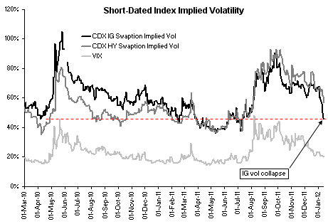
The short-term implied volatility of IG CDX swaptions is often traded against VIX on a relative value basis.  While VIX crashed in during the last couple of months, IG CDX implied volatility did not follow for some time.  Recently however, after a sharp correction, the short-term IG CDX vol touched 50%, a level not seen since August.


VIX vs IG CDX vol (and HY CDX vol). Source: Credit Suisse
The IG CDX vol seemed to be expensive relative to VIX recently, and in the last few days the market took out this perceived mispricing.  At 50% the implied volatility is now pricing in a roughly 100 - 150bp range for the index spread.  Once the index vol drops materially below 50%, it could be a signal that the market is again underpricing risk, and IG CDX swaptions may become an attractive hedge.

SoberLook.com

Friday, December 16, 2011

Implied volatility catching up with history

A recent post discusses how ineffective index options have been recently in terms of providing “tail risk” protection. Part of the explanation for this has to do with equity markets being range bound, dampening historical volatility. The chart below shows the historical (60 days) volatility vs. the implied volatility (3 months term, at-the-money) for SPY shares (S&P500 ETFs).  Earlier in the year implied volatility traded at a discount to historical volatility.   During the peak of the eurozone crisis - Aug-Sep - implied volatility spiked as was expected.  Those who had index put protection on, made money not only on the market declines, but on that volatility spike.

In October however we continued to have strong bid for vol (demand for options on SPY) as portfolio managers (concerned about going back to Aug-Sep sell-off) continued to add “tail risk” protection (index puts). Meanwhile historical volatility started declining as the market became range bound.  We had a disconnect between the actual volatility and what the market was pricing.   In November implied volatility caught up with historical volatility (decreasing option premiums sometimes even on days when the market was selling off), frustrating everyone who tried to hedge with index options. This month historical volatility came off further, making implied volatility look overpriced again – creating the same problem.

Historical vs. Implied vol for SPY (Bloomberg)
The next chart shows how VIX futures moved in the past month. The market is basically pricing a significantly lower downside risk (lower historical volatility) in the near term, with risks remaining unchanged in the longer term.

VIX Futures Curve (Bloomberg)
If the equity market continues to stay range bound or rallies, the longer term implied volatility will come off sharply as well to stay in lockstep with historical volatility.
SoberLook.com

Tuesday, December 13, 2011

The steepening vol curve and more risk decoupling

Implied volatility continues to sell off, with VIX down 10% (of vol, not points) month to date. The sell-off is particularly strong for short-dated options as VIX futures curve continues to steepen. The chart below shows VIX futures one-day move along the curve, with the nearby contract coming off sharply.

(Bloomberg)

With bullish year-end calls, we continue to have a case of "cognitive dissonance" as risk indicators diverge.  Surprisingly this time we are seeing the decoupling of the USD swap spreads and the US implied volatility index.  The two-year USD swap spread is up 4 bp today, while VIX is down some 3%.  This indicates further decoupling of short term risks in equities from medium term bank funding risks.

(Bloomberg)

Given that funding risk is generally associated with banks, this divergence is also visible in the underperformance of the financial sector during the past week.  The chart below compares recent performance of XLF and SPY ETFs (financial sector vs. the overall market).


The broad interpretation here would be that Europe's problems may impact US financials, but in the short-term the US equity market risks have diminished.  Again if one disagrees with this fundamental view, this may be a good opportunity to put on a trade: for example long SPY puts, receive fixed on the 2-year USD swap, and short 2-year treasuries. 

SoberLook.com

Friday, December 9, 2011

Index option hedges have not been effective: poor "option responsiveness"

As one trader said - "the freakin option hedges are just killing me!" The frustration in the market place has been that being long index options to hedge portfolios hasn't produced the results people were looking for. Typically as stocks sell off, implied volatility jumps. In the recent years for the S&P500 the relationship has on average been roughly -5.5 to 1. That is for a 1% move in the S&P500, the implied volatility should move 5.5% (of vol - not vol points) in the opposite direction (again, on average).  The chart below shows the daily regression between the two.


What market participants who use index options to hedge have been looking for is sometimes called "option responsiveness".  If you are long some SPY puts and the market drops, you would expect not only to get a kick from the underlying decreasing, but also from the implied volatility jumping based on the above ratio.  But that strategy hasn't been very successful lately.  In fact VIX (implied volatility index) to S&P move ratio has been on the decline. The chart below takes the monthly average of the ratio, using only the days when the S&P moves have been over 25bp (up or down).


There are numerous explanations for this recent trend, none of them very satisfactory.  The most popular one has been that portfolio managers had overloaded on put protection during the "dark days" of the crisis and with put positions "decaying" against them, used any market sell-off as an opportunity to lighten up.  That means that the ratio may hold when the market is up, but be below expectations when the market drops - working against those who are long puts.  This dampened the implied volatility increases during sell-offs, reducing "responsiveness".  Given the premiums people had to for the puts with recent elevated levels of implied volatility, it's no wonder portfolio managers are frustrated.  One trader called it "option fatigue".

Fundamentally, the 60-day historical volatility in the S&P500 is about 29% and VIX is roughly at that level as well.  Some may argue that implied vol should trade at a slight premium to historical, but the market is obviously pricing in some reduction in volatility going into the holidays.

SoberLook.com

Monday, August 10, 2009

VIX, the past and the future

The headline from Bloomberg this morning is "VIX Signals S&P 500 Swoon as September Approaches". What does that mean? It's worth taking a quick look at VIX, the story of it's past, and the story the futures curve is trying to tell us. For those who are interested in how CBOE computes the index and it's various applications, please see the document below from CBOE.

First, the history. As a measure of implied volatility in the S&P500, VIX is a powerful indicator of the level of fear in the system. It's a relative measure of where the Street prices risk. It has the same characteristics as credit spreads, but is more transparent and real-time than say CDS spreads. Let's take a look at the chart of VIX history from the beginning of the crisis. Again, most people think the financial crisis is an 08 event, but it actually started in early 07 as the first signs of sub-prime accelerating delinquencies showed up. VIX signaled that risk fairly early, stayed at slightly elevated levels spiking in early 08 with Bear, and finally exploding in the Fall of 08.

VIX


VIX continues to be at elevated levels relative to it's history, but it has collapsed relative to it's highs last year (it's now back to just post-Bear Stearns levels). One of the most painful features of being long volatility is theta (time decay), that can produce gradual yet painful losses. Many traders who do not see a catalyst for a selloff or increased volatility would rather not hold long volatility positions (unless they are hedging something else in the portfolio).

In spite of the massive VIX correction from the peak, the futures are telling us something else. Even though the overall levels have come off significantly, the VIX futures curve has steepened considerably. That means people are willing to pay considerable time decay as futures roll down the steeper curve to be long. And they want to be long specifically September/October maturities, with the curve coming off in later months. The Street is bracing for a selloff in equities this this Fall.


Interestingly, this "bump" in the futures curve has existed for a while. It has shifted forward and became more pronounced as the market rallies. The curve kept saying "the selloff is just around the corner". Ironically (at least in part) it may be that belief in the certainty of a impending selloff that has kept the market so buoyant.


Wednesday, June 24, 2009

The steepening volatility skew

From Bloomberg:
Downside skew, which gauges the relative cost of buying insurance against a slide in stocks, is now higher than it was when the Standard & Poor’s 500 Index dropped to a 12-year low on March 9. That indicates a “relatively high chance of downside moves,” the brokerage wrote in a report dated yesterday
Option skew is back to Feb-09 levels with out-of-the-money puts are getting bid up again as people are getting uneasy with the rally. The chart here shows how the skew (implied volatility for different strikes) flattened through the rally and steepened again recently (1 month options on SPYs with option strikes represented as % in or out-of-the money.)


Related Posts Plugin for WordPress, Blogger...
Bookmark this post:
Share on StockTwits
Scoop.it